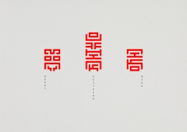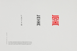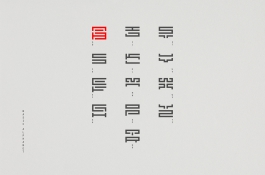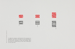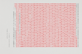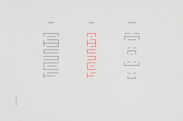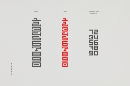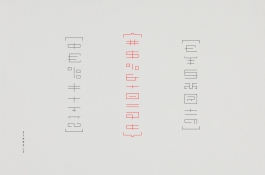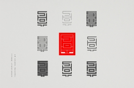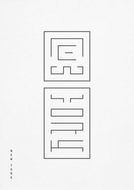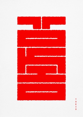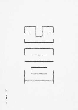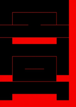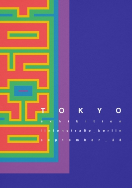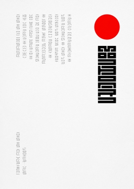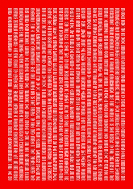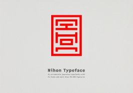
Nihon is an ornamental japonism typefamily with 24 fonts and more than 30.000 ligatures. Nihon builds the bridge between the western and eastern typography and allows you to write and read in latin letters with an japanese appearance.
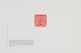
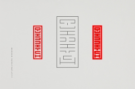
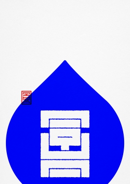
It started as a self initiated project in the typeclass of Sascha Lobe at HfG Offenbach, Germany. Due to my high interest in japanese graphic design and asthetics, my research lead me to the traditional Ukiyo-es‘. Woodblock prints from the early 17th century. Generally the prints were signed by the artists with their personal seal. The Inkan-Seal. Beautiful ornamental typographic masterpieces, but sadly unreadable if you are not able to speak japanese.
My thought was, to abstract and to completely new design all latin letters following the visual language of the traditional Inkan-Seals. The goal, to write in your language but with a beautiful japanese Inkan-Seal appearance. After several months of conceptualizing, designing and many nights with little sleep the first Nihon font was finished.
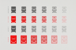
Nihon was first presented at the HfG Rundgang 2014 exhibition and the response was simply great. It went on and it was my aim to expand the Nihon font to a family with more glyphs and ligatures. To this day Nihon offers 4 styles with 6 weights each and counts more than 30.000 ligatures and glyphs in all fonts combined.
